


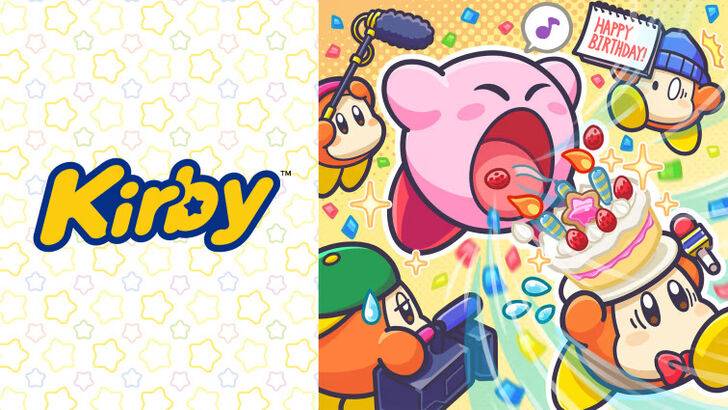
\"Angry Kirby\" Explained by Former Nintendo Employees
This article explores the evolution of Kirby's marketing in the West, focusing on the shift from a cute, pink puffball to a more "tough" persona. Former Nintendo employees shed light on the localization strategies employed to broaden Kirby's appeal.
The "Angry Kirby" Phenomenon
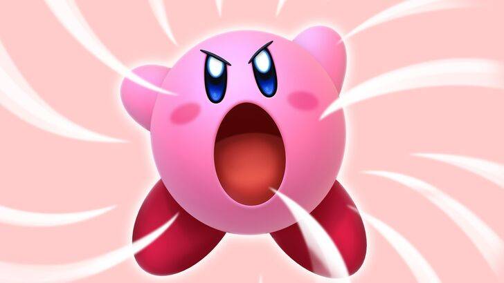
The Western perception of Kirby often centers around a "fiercer" image, a stark contrast to his original Japanese depiction. This "Angry Kirby," seen on various game covers and artwork (see below), wasn't intended to portray anger, but rather determination, according to former Nintendo Localization Director, Leslie Swan. She highlighted the cultural difference in audience preferences: while cute characters resonate universally in Japan, tougher characters appeal more to tween and teen boys in the U.S., a key demographic. Kirby: Triple Deluxe Director, Shinya Kumazaki, corroborated this, noting that while cute Kirby is a major draw in Japan, a "strong, tough" Kirby resonates more in the West, although this varied by title.
Marketing Kirby as "Super Tuff Pink Puff"
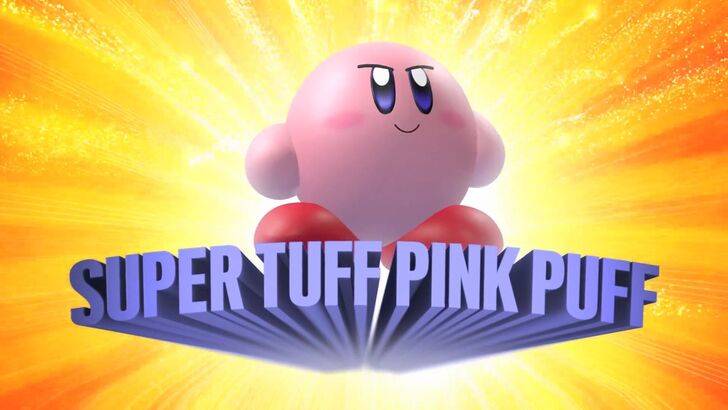
Nintendo's marketing strategy aimed to shake off its "kiddie" image. The "Super Tuff Pink Puff" campaign for Kirby Super Star Ultra (2008) exemplifies this shift. Former Nintendo of America Public Relations Manager, Krysta Yang, explained the conscious effort to portray Kirby as a more action-oriented character to attract a broader audience, particularly boys. While recent marketing has focused less on personality and more on gameplay, the perception of Kirby as "cute" persists.
Localization Differences and the "Play It Loud" Campaign
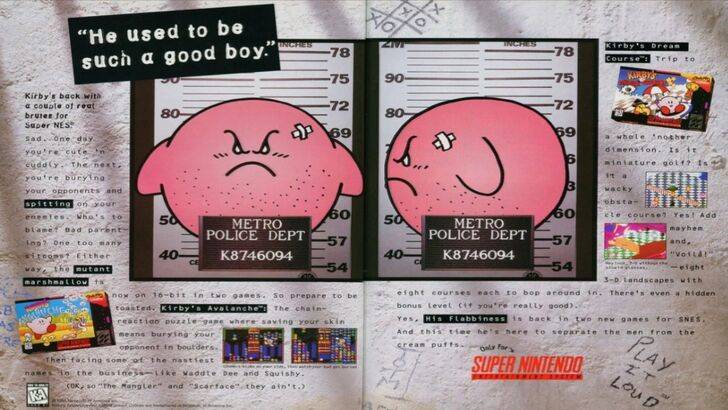
The divergence in Kirby's Western and Japanese presentation began early. A notorious 1995 "Play It Loud" advertisement featured a mugshot-style Kirby. Subsequent games like Kirby: Nightmare in Dream Land (2002), Kirby Air Ride (2003), and Kirby: Squeak Squad (2006) showcased Kirby with sharper features and more intense expressions. Even Kirby's Dream Land's (1992) U.S. release featured a ghostly-white Kirby, a departure from his original pink hue due to the Game Boy's monochrome display. This early color discrepancy, coupled with the desire for broader appeal, led to the "tougher" Kirby image in Western box art.
A More Global Approach
In recent years, Nintendo has adopted a more unified global approach to marketing and localization. Closer collaboration between Nintendo of America and its Japanese counterpart has led to greater consistency in Kirby's presentation, minimizing regional variations. While this ensures brand consistency, it potentially sacrifices some regional nuances, potentially resulting in "bland" marketing. However, the increasing familiarity of Western audiences with Japanese culture has also influenced this shift.
-
 Mar 17,25All Split Fiction Achievements & How to Unlock Them Dive into the captivating co-op adventure Split Fiction from Hazelight Studios! This guide outlines every achievement, ensuring you and your partner conquer every challenge. While some trophies are earned naturally through the story, many require thorough exploration and unique actions. Use this g
 -
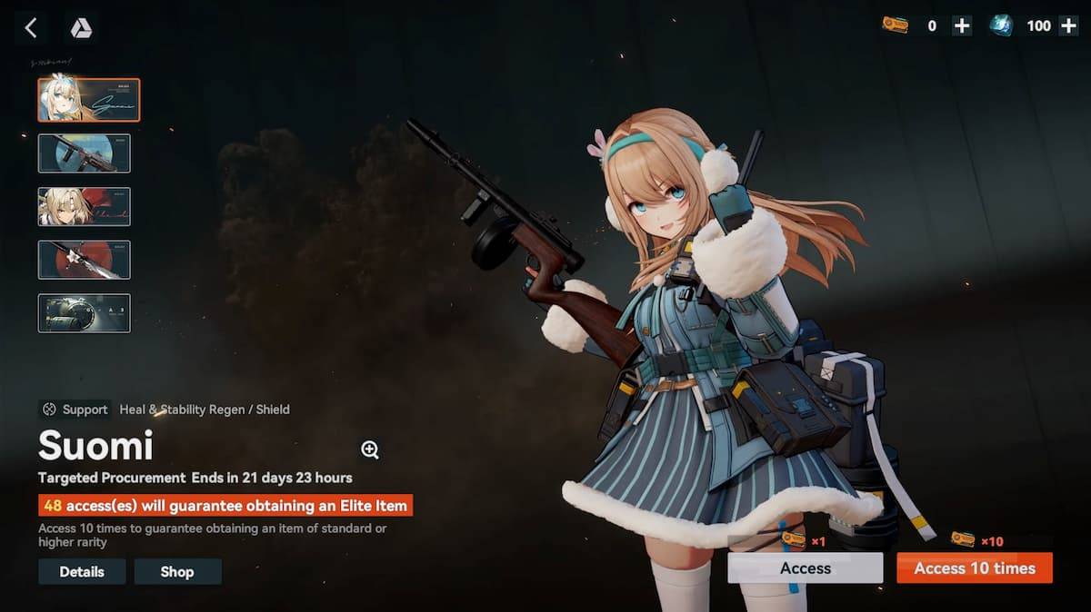 Jan 16,25Girls' Frontline 2: Exilium Tier List Released Another free-to-play gacha game, another character ranking to guide your investment choices. This Girls’ Frontline 2: Exilium character tier list helps you prioritize which characters are worth your resources. Girls’ Frontline 2: Exilium Character Tier List Here's a breakdown of currently available
 -
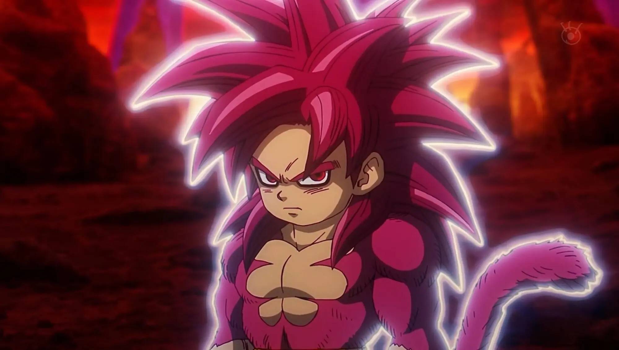 Mar 19,25How Does Dragon Ball Daima’s Finale Explain Goku Never Using Super Saiyan 4 in Super? The climactic battle in Dragon Ball Daima's finale pits Gomah against Goku, showcasing Goku's newly acquired form. This episode naturally led many fans to anticipate an explanation for Super Saiyan 4's absence in Super. So, how does the finale address this?In episode 19, after Glorio's wish restore
 -
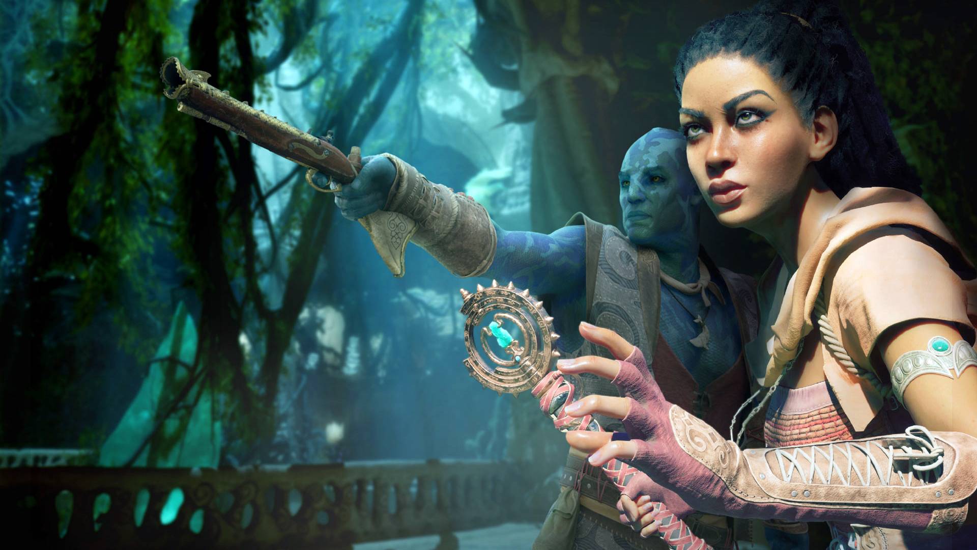 Mar 18,25Avowed Best PC Settings for Max FPS *Avowed*, a visual masterpiece, immerses you in a richly detailed world. To fully appreciate its stunning graphics without sacrificing performance, optimizing your PC settings is key. This guide helps you strike the perfect balance between breathtaking visuals and smooth gameplay.Recommended Videos